Understanding Customer Flow Leads to 120% Sales Increase
+120%
sales
+109.90%
sale conversion rate
+42.33%
engagement in the test area
The Background
Carefree Dental provides an alternative to traditional dental insurance. Customers pay a flat rate every month for a dental discount card that works anywhere in one of the largest networks of providers nationwide.
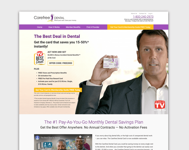
Our priority was to optimize the Carefree Dental homepage to drive more sales, as it was the main entry point for traffic to the site. One area of focus was the billboard—the first reveal users would see.
Our homepage billboard featured a main CTA that read “Sign Up Now!”, with a secondary link below that read “Or find a provider near you.” The assumption was that users would convert or confirm their desired dentist was in-network before converting.
Though it was less attention-grabbing, our data showed that more users were clicking the “Find a Provider” link. Users were consciously surveying the section and deciding that finding a provider was a better option than signing up for an account at that time.
The underlying goal of the optimizations was to drive conversions, but our stats showed that many visitors weren’t ready to make that commitment yet. Users were instead looking for education and assurances first. Driving more conversions would not be as simple as adding more links to “Sign Up Now!”

The Execution
The “Sign Up Now” and “Find a Provider” links were driving plenty of traffic, but using Google Analytics Behavior Flow, we could see that the traffic wasn’t performing as well as we would hope.
46.7% of users that headed to the Signup page from the Homepage dropped off before taking any other action. For the Find a Provider page, 42% of users from the Homepage dropped off.
However, for another one of our main navigation links — the How it Works page — only 20.9% of users from the Homepage were dropping off.
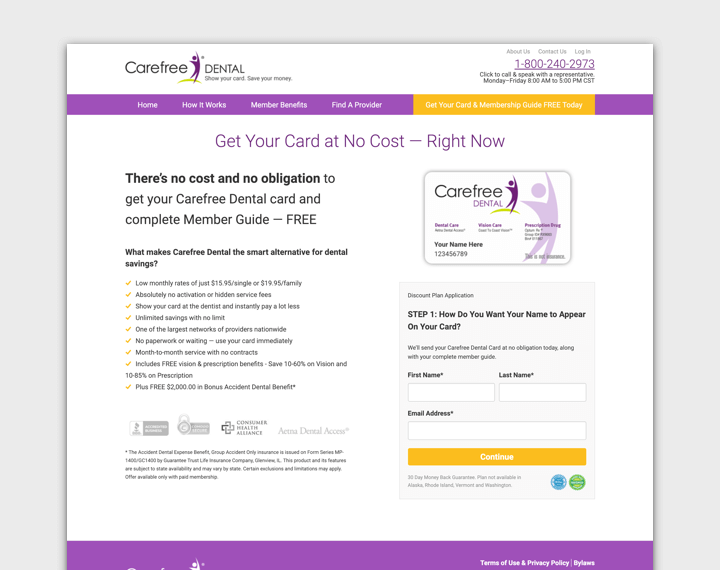
Given these numbers, we decided to run a simple test: replace “Sign Up Now!” with “Learn How it Works!” and point the homepage billboard CTA to the How it Works page.
Objectives:
- Drive more account signups


The Result
This simple CTA change led to more than double the signups over the course of the test. The original CTA had a conversion rate of 0.60%, while the new version had a conversion rate of 1.26% — a 109.90% increase.
While the increase in signups was enough to declare the test a success, we also kept an eye on smaller micro-conversions to make sure nothing else was negatively affected.
We found that not only did the new CTA lead to more conversions, it also drove more engagement in the test area. Over the course of the test, our new button and link combo generated 42.33% more clicks than the original.
Each of these clicks represented a visitor moving further down the sales funnel from the homepage, which can be valuable. It’s hard to sell to visitors you don’t know anything about, and it’s hard to learn from visitors who don’t do anything on your site. The more users engage and the more pages they view, the more you can learn and optimize.

